x/website: new playground leaves little vertical space for the editor #49769
Comments
|
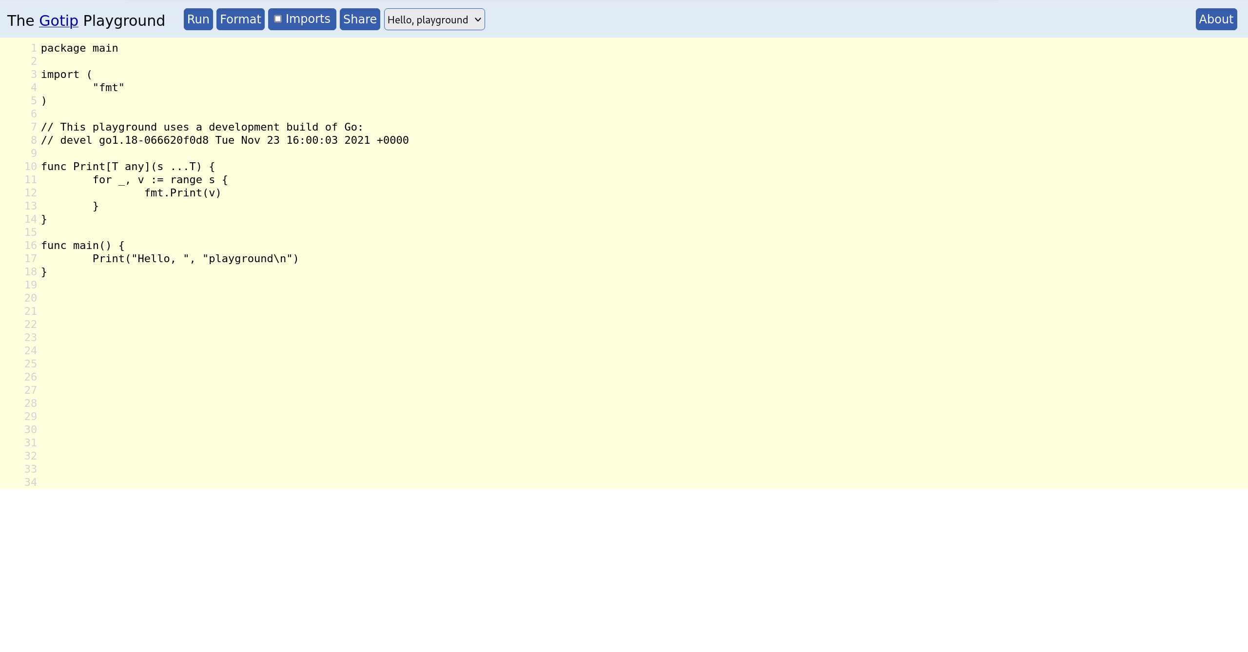
Ah, https://gotipplay.golang.org is still live, for some reason. On my same browser and screen:
I have space for 34 lines there, double (!!!) the amount of code. So much nicer to view and edit code. |
As an idea - what about making the BLM banner part of the Go blue banner? They are both almost entirely blank space. Vertical pixels should not be spent that quickly. |
|
Another option is to split code and output vertically rather than horizontally. Code is usually longer than wide. |
|
I thought about that too, and while it would work great on wide screens like 16:9, it would be pretty bad for any form of vertical window or screen. Imagine opening the playground on a smartphone, for instance. If we want the split to be vertical on wide screens, then the page should revert back to a horizontal split when the screen is taller. |
|
@mvdan, in this incarnation of the playground, both input and output are now resizable windows - you can drag the bottom right corner, just like the GitHub box I'm typing this message into. It seems like maybe you didn't notice that? The initial split has a large enough output to make the examples all work reasonably well (in particular, the game of life example). If you make the window taller (on my Mac that ends up meaning about 1070 pixels) then the input eventually doubles in size relative to the output. |
I indeed hadn't noticed - it's such a small UI element on the far right of the page, and it's even overlapping with the scroll bar. In contrast, on GitHub, it's only two thirds of the way to the right side of my screen, and it doesn't overlap with the scrollbar:
And the new playground's, when scrolled all the way down as well (note this is all the way on the edge of my wide screen):
I zoomed out a couple of times and indeed got more space for the input code relative to the output. I'm still not sure that makes sense. In almost all examples, and the majority of playground links I've used in the past, the height of the input is far more important than the height of the output. As long as we keep the first resizable, I do think the default should be what works for most people by default, just like what the old playground did. If we're really worrying about the game of life example, perhaps opening that one example can trigger making the output textbox a bit taller, just like I can do manually via the UI. That seems like it still solves that one example while keeping the site generally more usable. All the above still concerns about the size of the input textbox relative to the output textbox, though. There's also the part where the page spends more space in content that's not input code or output text, meaning we have less space to begin with - which I tried to explain in the original post. I'd still very much like to see that alleviated somehow. |


|
Thanks for bearing with us as we iron out these issues. As with anything new, there are going to be things that got missed, and people are looking more carefully than they did at go.dev before (as evidenced by the download button!). I don't believe the old playground was the global optimal layout. In particular I think the output was too small. I wouldn't want to double the current code size by default. But I think we can bump it by 50% or so. I sent CL 366978 to do that. I don't want to touch the header right now, but CL 366974 will make the header scroll away (not pinned to top of page), which should help on small devices. |
|
Change https://golang.org/cl/366978 mentions this issue: |
|
I should add: I don't understand what magic GitHub is using to make the scroll bar not hit the window resize grabber. If anyone can explain it to me well enough, I am happy to do the same on go.dev/play. Or simple CLs welcome! |
|
The changes you proposed sound reasonable - I'll be sure to check out the playground again once they go live. I have absolutely no idea what wizardry happens with GitHub's scrollbar and "resizable" icon. I guess it's a fairly minor UI nit, as long as the input textbox is tall enough by default, so I don't think it deserves more attention right now. |
|
Right now the |
|
@seankhliao Thanks, I tried moving the resize css to .Playground-input (the textarea) but then the outer div doesn't resize along with it. Right now the textarea is set to have height 100% of the inputContainer div, so it follows along as the div is resized. I don't know how to make the div follow along as the textarea is resized. |
On go.dev/play, make code box 50% bigger by default,
and lower the "tall screen" threshold (where it gets even bigger) too.

Fixes golang/go#49769.

Change-Id: Iddd3138cc5674a997023ec955caf768e2a70d284
Reviewed-on: https://go-review.googlesource.com/c/website/+/366978
Trust: Russ Cox <rsc@golang.org>
Reviewed-by: Jamal Carvalho <jamal@golang.org>
Website-Publish: Russ Cox <rsc@golang.org>
On my 16:9 screen, less than a third of my screen's vertical space is used for seeing or editing code:
There are two banners, the vertical space for the title and buttons, another nearly-third of the page for the output, and then I can even start seeing some of "about the playground".
I really think the code deserves as much vertical space as we can give it. Especially with longer examples, or examples containing multiple files via txtar, having to scroll around while viewing just 17 lines at a time is painful.
The old playground didn't have this issue (got an old screenshot from google, because play.golang.org no longer exists):
In particular:
cc @dmitshur
The text was updated successfully, but these errors were encountered: