x/pkgsite: pkg.go.dev website width too small and truncated #44172
Comments
|
Thanks for the suggestions. Adding @georgehu @fflewddur for UX feedback. |
|
I have a similar complaint but on a smaller monitor.
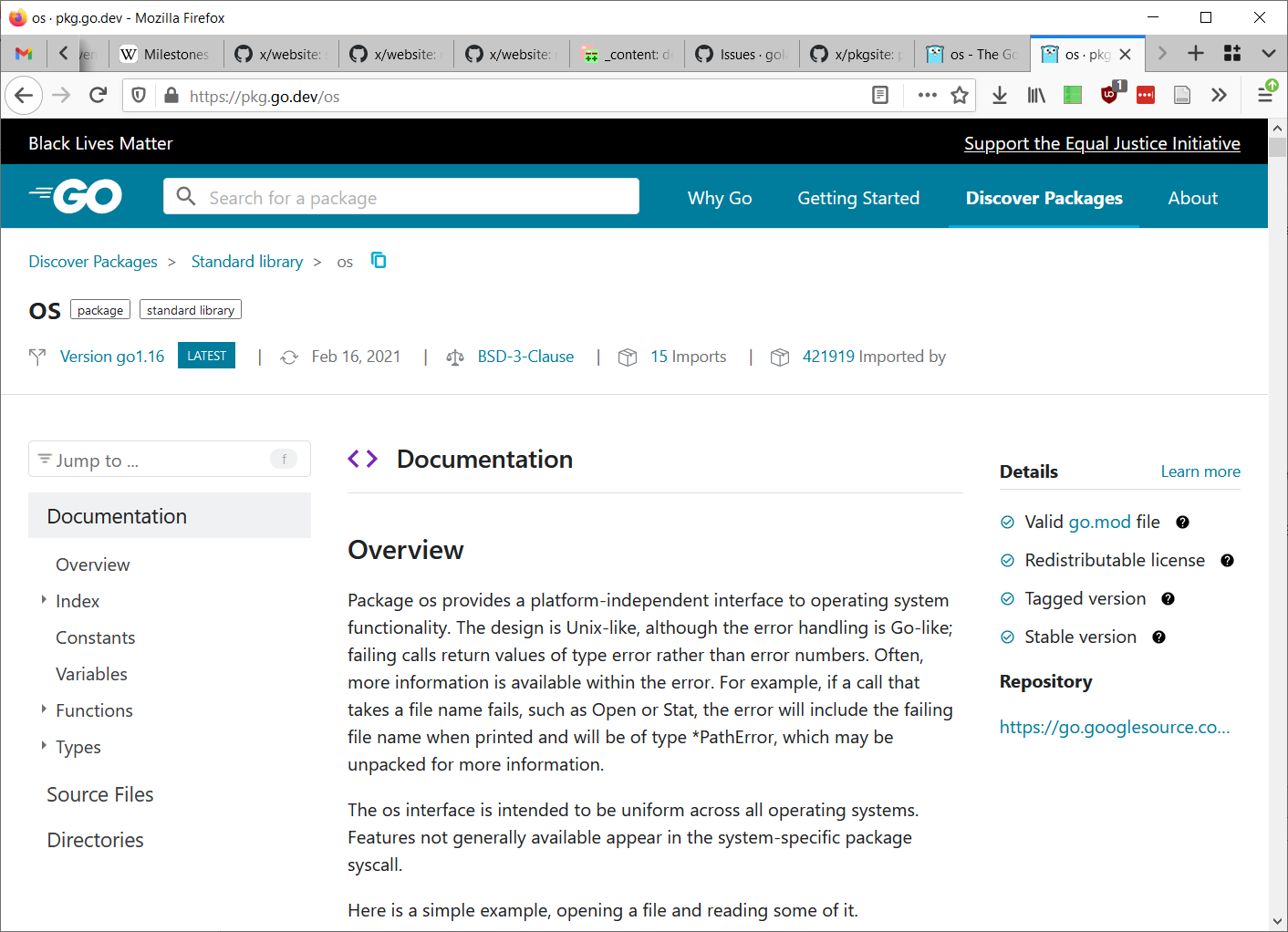
The screen feels incredibly cramped and painful to read. There are five(!) header bars on the top, and two side bars. The documentation is squeezed into a small area on the bottom of the screen. The info bar on the right is completely pointless for a standard library package, yet it takes up 1/4 of the horizontal space. Scroll down. Like in aletheria7's screenshot, the constant block is cut off. The useless righthand info box isn't even visible any more, yet it still takes up valuable screen space. And, this is just a personal preference, but I would prefer not to have the nav bar follow me everywhere. Compare with https://golang.org/pkg/os:
Only two header bars. The content starts at about the same place down the page due to the table of contents, but the top half of the screen is mostly empty space instead of information-dense headers. When you scroll down the header bars and TOC disappear. There are no sidebars, the entire screen is dedicated to displaying the docs. The constant block is not cut off, and even has room to spare. |


|
Change https://golang.org/cl/325571 mentions this issue: |
|
Change https://golang.org/cl/325570 mentions this issue: |
The unit page is refactored for use with the base
page layout. The new layout addresses usability
issues caused by the current responsive breakpoints
and cleans up stylesheets by removing dead styles and
componentizing UI code.

Viewports below 1280px will have a single column stacked
layout. Viewports between 1280px and 1792px will have a
two column layout with the navigation outline in the right
sidebar. At 1792px we'll render a three column layout.

For golang/go#44172

Change-Id: Ic49107f02c6cf0bcdfc42f8668df4f591cebe6a9
Reviewed-on: https://go-review.googlesource.com/c/pkgsite/+/325571
Trust: Jamal Carvalho <jamal@golang.org>
Run-TryBot: Jamal Carvalho <jamal@golang.org>
TryBot-Result: kokoro <noreply+kokoro@google.com>
Reviewed-by: Julie Qiu <julie@golang.org>
|
We are testing out layout changes on the beta site that address this issue. Take a look at https://beta.pkg.go.dev/github.com/google/gopacket@v1.1.19/layers#pkg-variables. |
|
Looks good. It would also be nice to see Type "maker" functions listed under Functions. ExampleThe io package has a package function name of TeeReader . This is properly listed under Type Reader, however I would also like to see it under Functions. After all, it is a package Function. Sometimes package maker names do not always reflect the type and it's difficult to remember was io.Tee a TeeReader or was it a TeeWriter. You then have to scroll/search the whole page looking for the Tee thing because it becomes cumbersome to look through every Type for the Tee maker function. Please add all package Functions under Functions. Thank you. |
|
Take a look at the description for the io.Writer function. Why does the second paragraph break on "any" and "the"? My screen has another 6 inches to display the paragraph on the same line? The third column (most right column) for the io package has only 4 text lines at the top. This shortens the center column down the whole page. Why waste all of this screen real estate for just 4 summary lines at the top? I would like to use the full width of my device screen when viewing information. Can we just remove/move the third/right column data and merge it in somewhere else in column 1/2? This would allow the center column to use all of the screen to the right edge. Yeah. Now I don't have to scroll constantly just to read a paragraph. Please use the whole screen. CSS Grid Layout is a pain to use for documentation. CSS Flex Layout is much easier to code for text flow/wrapping features. It's very tempting to want to use CSS Grid Layouts for page layouts, but trying to hammer it into shape is where one can spend an enormous amount of time getting the remaining 20% right. CSS Grid Layout just truncates things into small boxes. CSS Grid Layout shines for laying out icons, photos across a page. CSS Flex Layout row/column features are much easier to use for paragraphs and flowing columns for Responsive Design. Just my two cents coming from using both layouts. |
This is off-topic for this issue. See #39813 for a related discussion. |
Based on the advice of our UX team we are planning to let the text in code blocks overflow while capping paragraph width to support readability of paragraph text. There is a related thread in #45073. There will likely be additional changes to the third column before we roll this out. Stay tuned! |
Off topic? I disagree. Top-level package functions should listed under Functions. Right? I read the thread. I now see others would like to see maker functions listed under Functions too. Proposals
|
Overflowing text does not enhance readability when you cannot read the text. Disabled people should not be forced to grab the mouse to scroll and read text when it can be shown on the screen. How about using an overridable CSS class for all paragraphs. Then I can change the width to support my big browser screen and read the documentation? |
|
Thanks for the suggestions, @alethia. Since the specific issue here is “website width too small and truncated”, and that has already been addressed by @jamalc and our UX team, we are going to close this issue. Could you please file a new issue, for any feedback that is not already being discussed on a separate thread? That would help us be able to better understand your suggestions and work with our team to address them. Closing this issue. |
What is the URL of the page with the issue?
(https://pkg.go.dev/github.com/google/gopacket@v1.1.19/layers#pkg-variables)
What is your user agent?
Mozilla/5.0 (X11; Linux x86_64) AppleWebKit/537.36 (KHTML, like Gecko) Chrome/88.0.4324.150 Safari/537.36
Screenshot
What did you do?
Open Google Chrome to read the gopacket/layers package.
What did you expect to see?
I would like to see all of the text normally wrapped on my big monitor.
I would like a page option that allows rendering the full page without 2" margins. I would like a Desktop Mode that allows the page to flow the entire with of the screen.
I would like horizontal overflow scroll bars to view the page when content is too wide.
What did you see instead?
I have a 1920x1200 screen resolution and I cannot read the package documentation. The CSS column widths are truncated, and there are no overflow scroll bars.
Documentation Column Width Truncated
Look at the Functions "GetLCMLayerType(fingd... and RegisterLCMLayerType(n... . See how they are truncated and have ellipses?
Variables Section Width Truncated
See how "LayerTypeARP = gopacket.RegisterLayerType(10, gopacket.LayerTypeMetad" is truncated?
The text was updated successfully, but these errors were encountered: